Graphic Design Elements to Include on Your Paid Campaigns

Did you know that the average person sees between 6,000 and 10,000 ads per day?! Making your ads stand out can be a challenge, so you need to be thoughtful about the message you’re sending to your intended audience. By utilizing the correct visual elements in your paid ad campaigns, you can capture your audience’s attention and make a great first impression.
Let’s cover five essential graphic design elements that are crucial to any successful paid campaign.
Typography
Typography refers to how you arrange your text within your advertisement. Pick a font that sets the tone and mood you’re looking for. Some fonts are fun while others are more serious in nature. Size and density have an impact as well. Small, thin letters are more elegant and timeless, whereas thicker, bolder letters convey a powerful message.
Visuals
Visuals refer to the actual images you include in your ads to grab your audience’s attention. Mix up your visuals by using a combination of illustrations, photographs, graphs, pie charts, logos and videos. Keep in mind that your visuals are the key part of your ads, so it’s important to choose something that is visually appealing and easy to understand.
White Space
Successful ad campaigns rely on the proper use of white space. When creating an ad, you’ll start with a blank slate and gradually insert various elements into your web design in Baton Rouge – visuals, typography, etc. This space helps you balance contrasting elements, direct attention to the right places and create the right vibe.
Color
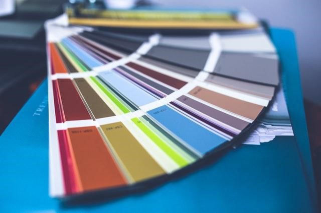
Don’t let color be an afterthought – you should carefully select your color palette based on the mood of your campaign. This way, you can elicit the emotional response you’re hoping for. Play around with various color combinations until you find one that feels right. Also pay attention to how all of the visual elements work together.
Lines and Shapes
In graphic design, lines have an artistic purpose. They help organize information, create a mood and build a sense of direction for users to follow. Keep in mind that lines can be more than just straight. They can also be curved, dotted, thick or thin. You should blend them together with organic and geometric shapes for a clean and uniform design.
Even though graphic design is nothing new, it’s sometimes overlooked when creating paid advertisements. For the best results, evaluate your top-performing ads and look for trends in the type of design used. Also be sure to take advantage of the image editing and graphic design tools available online.


